One of the amazing features of this bull market is how few investors seem to be truly buying into it. We’re not talking about short-term sentiment measures, which remain mixed (options investors are relatively giddy, individual investors cautious, etc.), but rather longer-term money flows.
According to the Investment Company Institute, from the beginning of 2015 through October 2016, money poured out of domestic equity mutual and exchange traded funds (ETFs) to the tune of $217 billion. That reflected the mini-panic seen during the 2015-2016 market downturn, the fears surrounding Brexit and hesitation leading up to the U.S. election. It was a sign that there was plenty of pent-up demand for stocks, which was unleashed once the election was over.
[text_ad]
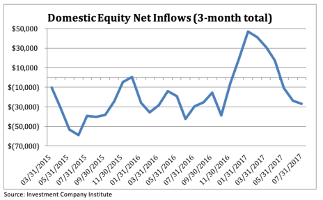
Once the market took off in November, money did come into stocks—but only for three months! Now, money is being yanked out of the market again. Shown below is the three-month moving average of net inflows into domestic equity funds since early 2015; you can see that the figure was solidly negative through late last year, and then spiked positive into the end of January.
But since late January, it’s been all downhill, with nearly $30 billion withdrawn since the start of May. In fact, despite the bull market this year, money flows have been net negative since the beginning of 2017, a clear sign investors aren’t anticipating much further gains.
Another way we like to look at money flows is on a relative basis—specifically, money flows into domestic equity funds versus flows into bonds. Theoretically, if money is gushing into “safe” bonds and out of “risky” stocks, it’s probably a good indication that investors aren’t overly bullish and are valuing safety and steadiness over volatility and potential big rewards. And that’s exactly what we’re seeing now in this bull market.
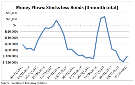
The chart below is a rolling three-month total of money flows into stocks minus those into bonds. When the figure is above zero, it means more money is flowing into stocks than bonds, and vice versa. Similar to the first chart, money flow was heavily negative for most of 2015 and 2016 heading into the U.S. election and then spiked higher for a bit.
But what’s shocking is that as of the end of June, the difference in money flows between stocks and bonds hit a new multi-year low. That’s not a sign of greed! All in all, since the start of 2015, there have only been five months (out of 31) where flows into domestic equity funds outpaced flows into bond funds.
These money flow statistics don’t tell you much about the short-term direction of the stock market, but on a longer-term basis, they give you a strong indication of the sentiment of the average investor. Right now, with money flowing out of stocks and gushing into bonds, it’s clear that most people aren’t bullish on the stock market—a good sign from a contrary point of view.
*Note: This article was an excerpt from the July 19 issue of Cabot Growth Investor. To subscribe, click here.
[author_ad]


